Nordic Wall: A minimalist business theme for interior designers & architects
Nordic Wall is a business-focused theme crafted for brands that want to present their products or services with elegance, clarity, and a natural aesthetic. Perfect for interior designers, furniture manufacturers, and premium product lines, it offers a minimalist, highly visual layout that elevates the perceived value of your offering. From image sliders and product showcases to key metrics and blog integration – Nordic Wall gives you all the tools you need to build trust and present your brand with confidence.
The homepage of Nordic Wall is carefully structured into multiple modular sections, each designed to showcase your product’s strengths in a visually engaging way. With flexible layout options and rich visual blocks, the theme empowers you to create a compelling brand narrative that reflects your values and design sensibility.
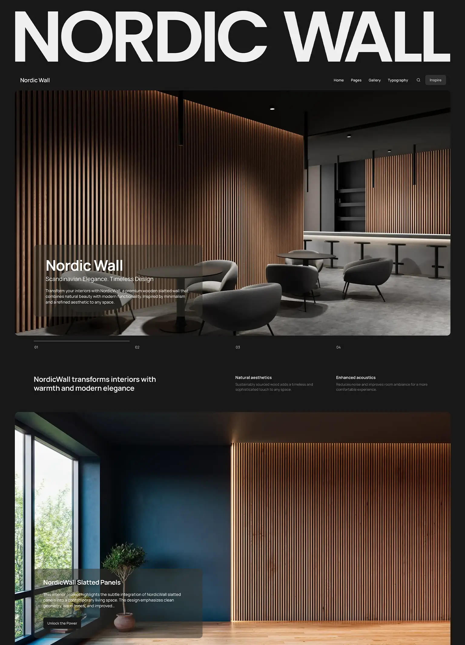
Hero section: visual impact from the first scroll
The hero section in Nordic Wall is designed to make a strong first impression with maximum visual clarity. You can choose between a static layout – ideal for highlighting a single product or message – or enable the slider mode, which adds dynamic transitions and multiple slides, perfect for showcasing a broader range of offerings.
If slider mode is selected, you gain access to a wide set of configuration options. For instance, you can activate a fade transition for a smooth cross-fade between slides, or a parallax effect that brings a sense of depth and motion to your visuals. Slide duration, autoplay intervals, drag-free movement, loop mode, and even wheel gesture navigation can all be finely tuned to match your presentation needs.
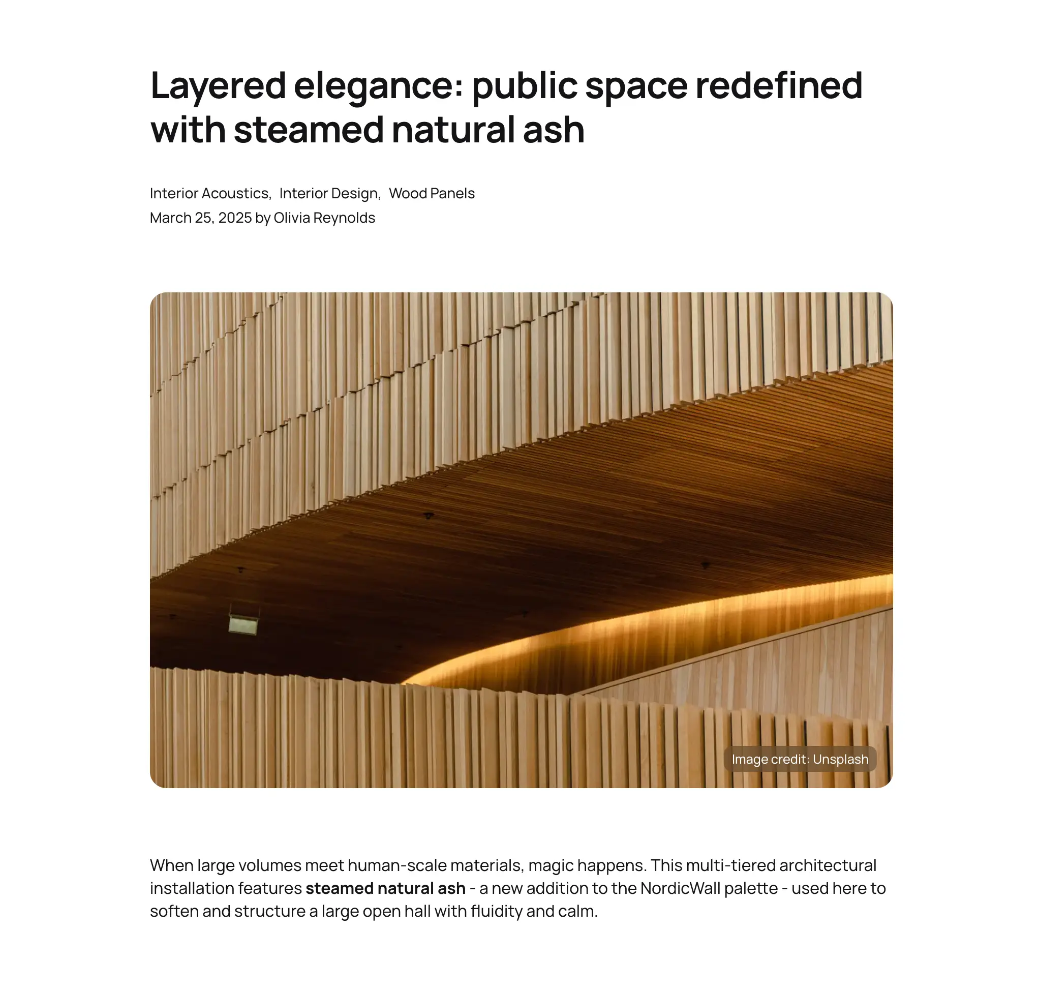
The slider can display content from various sources such as latest posts, featured posts, selected posts or pages, posts from selected tags. You can also manually build your slider using a visual interface, which leverages the repeater system to let you upload images, add custom text, and assign button actions – all without writing a single line of code.
Whether you want a clean and static hero or a fully interactive product carousel with storytelling potential, the hero section adapts to your brand’s visual language.
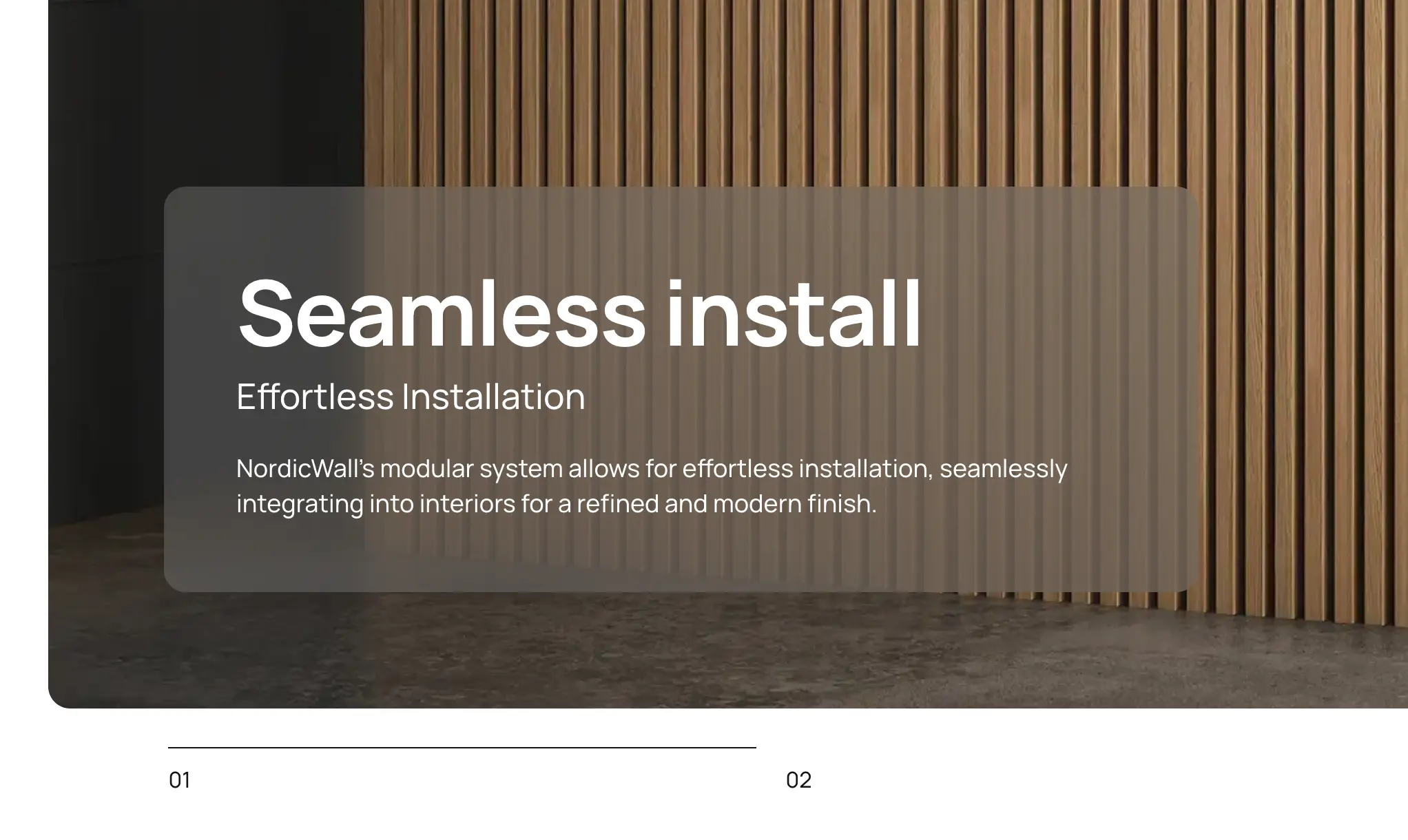
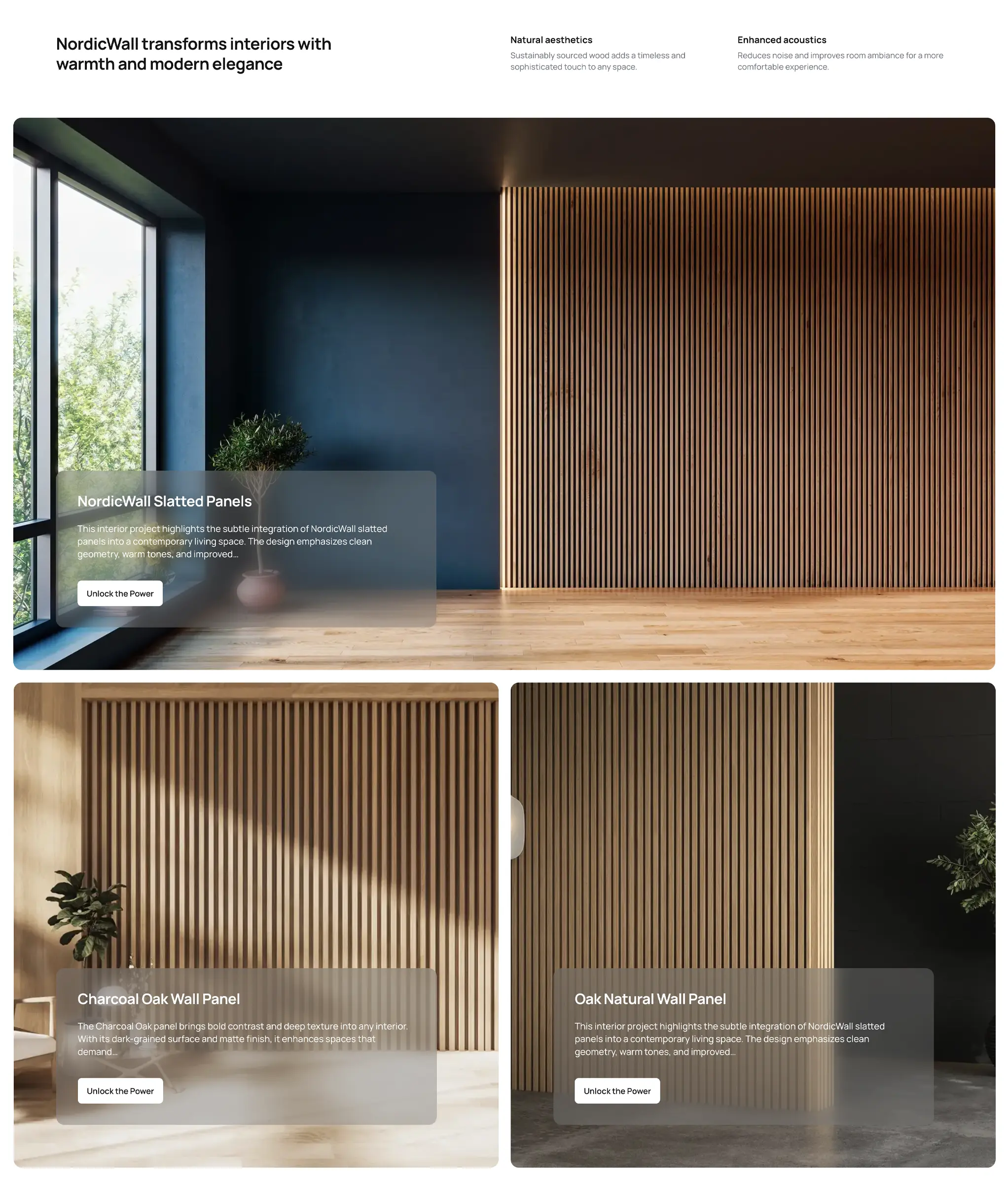
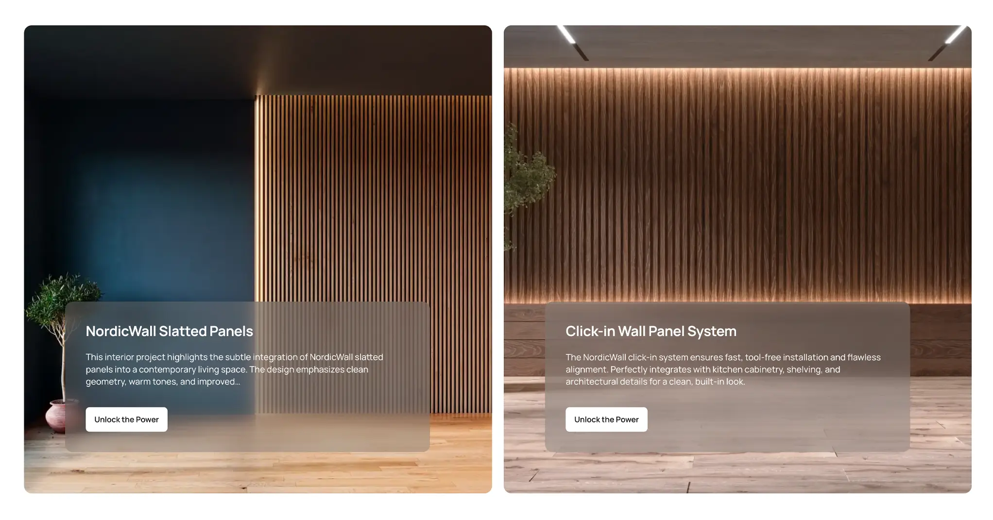
Features sections: two flexible blocks to highlight your product
Nordic Wall includes two dedicated features sections that help you communicate the value of your product or service in a structured and visually appealing way. At the top of each section, you can display a section title along with an optional text block that supports one- or two-column layouts – perfect for describing benefits, listing technical specifications, or explaining use cases in more detail.
Below the text area, you can enrich your message with a grid of images presented as visual tiles. These tiles can be populated from various content sources – including selected posts or pages, posts from selected tags, or manually crafted custom content. This flexibility allows you to decide whether to highlight content already published on your site, or create a dedicated visual showcase tailored to this section.
The grid layout is highly customizable, offering multiple display formats. In addition, all tiles follow global layout rules which you can define in the theme settings – including image aspect ratio for mobile and desktop, image fit mode (e.g., cover), and whether to show titles, dates, or excerpts. This level of control ensures consistent styling across your site while giving you the freedom to balance visual rhythm with storytelling clarity.
When using the custom content option, you can build the entire section manually using a visual interface. This editor allows you to add each item one by one – including image, description, and button – making it ideal for tailored feature presentations without relying on existing posts or pages.
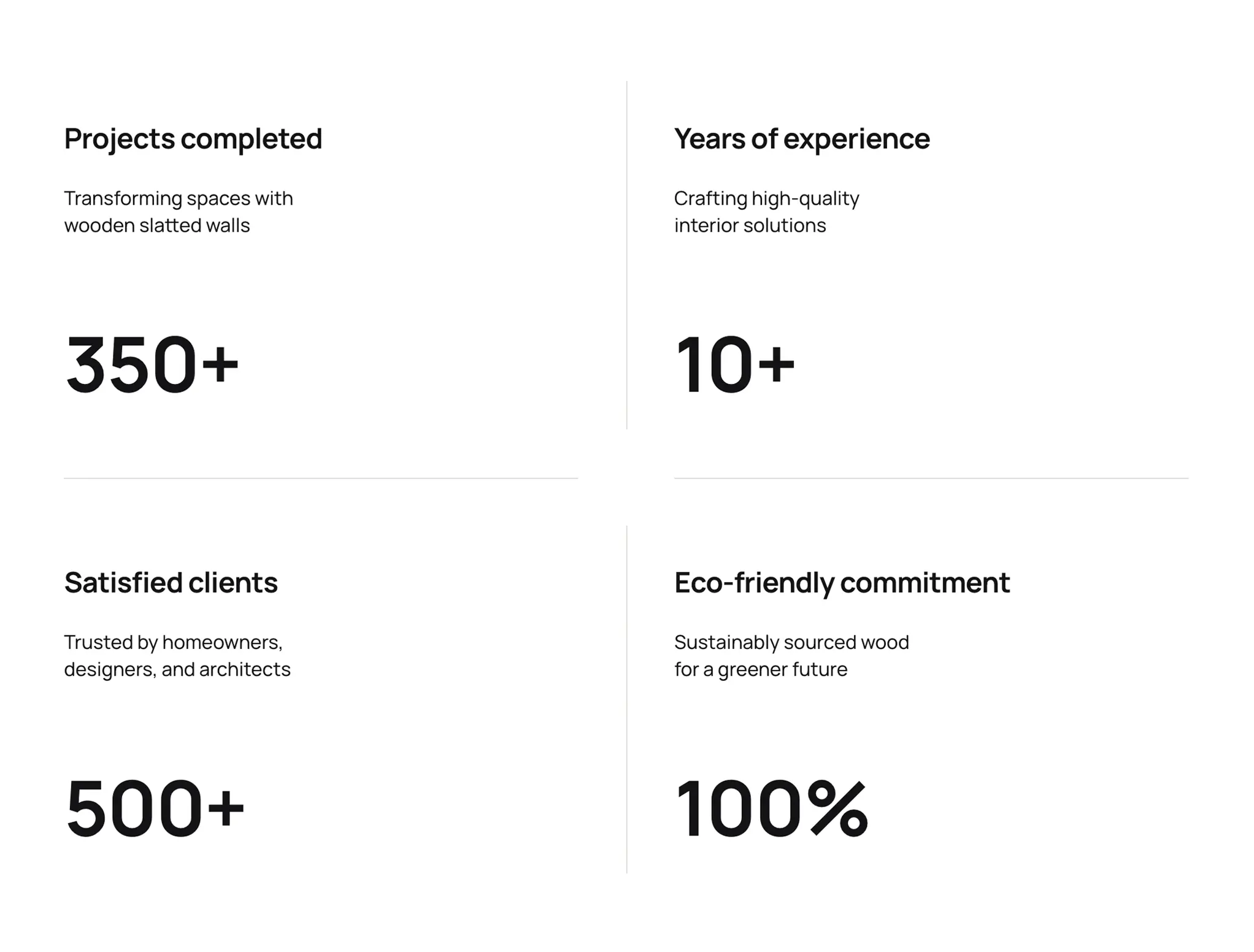
Key metrics: visual proof of your impact
Nordic Wall includes a dedicated Key Metrics section, ideal for presenting important company facts and achievements at a glance. Whether you’re highlighting completed projects, years of experience, satisfied clients, or your commitment to sustainability – this section gives you a clear and attractive way to build trust through numbers.
You can choose from a 2-, 3-, or 4-column layout depending on how many metrics you want to showcase. Each block allows you to enter a title, a short description, and a prominent statistical value that draws attention and adds credibility to your brand story.
It’s a perfect space for building trust through clear data – displayed with simplicity and elegance, in line with the theme’s minimalist visual language.
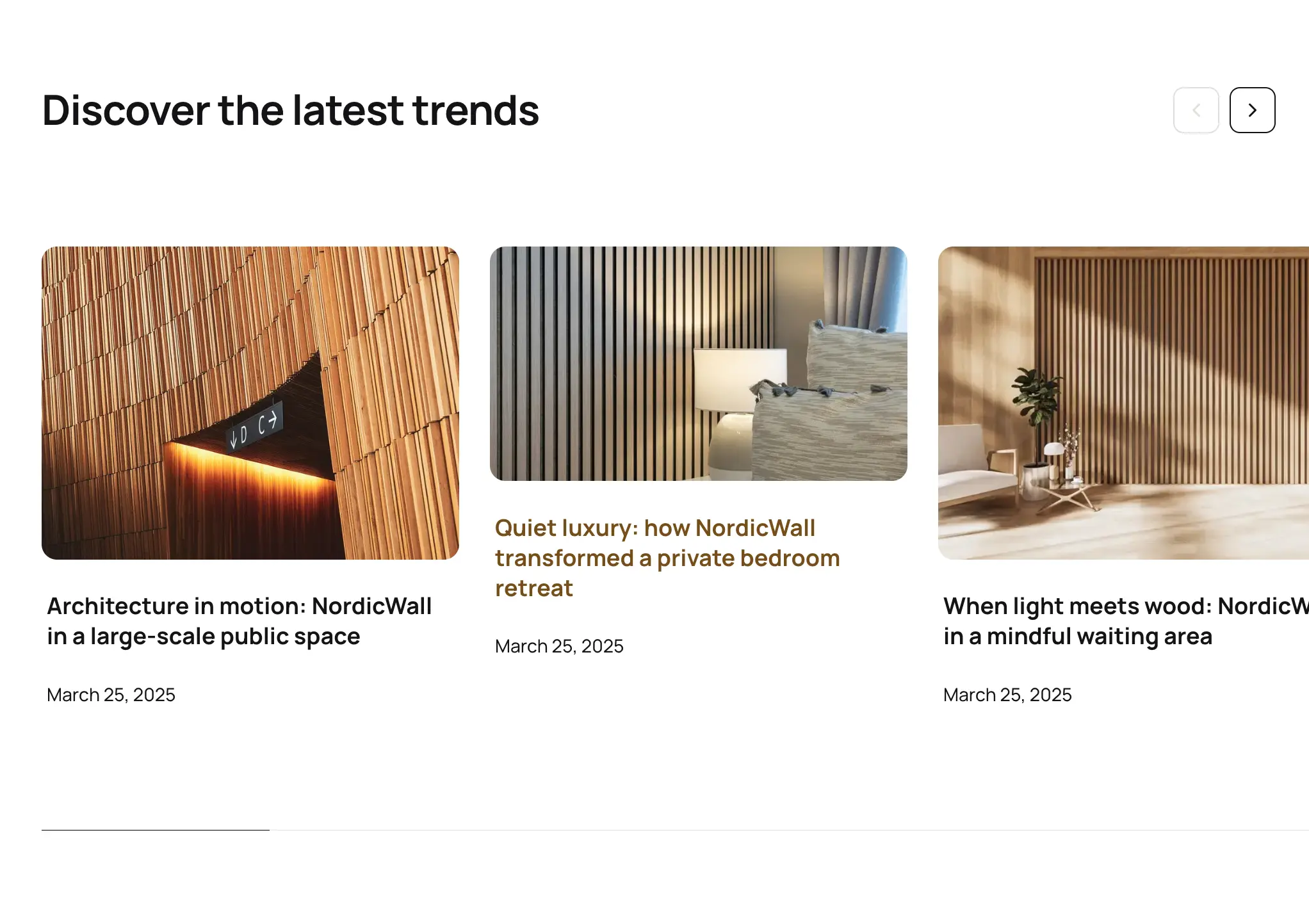
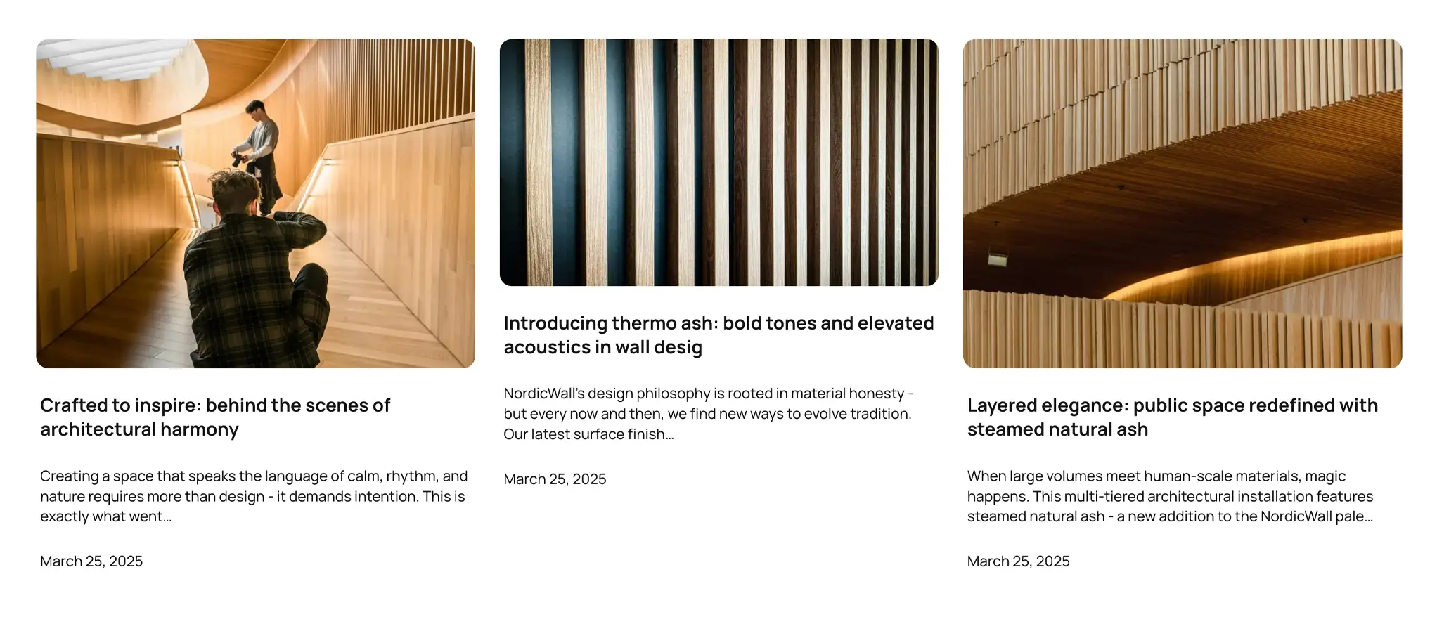
Insights section: dynamic showcase of your latest content
The Insights section is a built-in content slider designed to keep your homepage fresh and informative. By default, it displays the latest posts, but you can easily switch the content source to show posts from specific tags, manually selected posts, or pages – giving you full control over what gets highlighted.
Content is displayed in a horizontal slider format enhanced with a smooth progress bar that visually indicates the scroll position. It’s a compact, elegant way to surface articles, updates, or any form of editorial content without overwhelming the layout.
The slider includes a range a wide range of configuration options – such as scroll speed, drag behavior, autoplay, wheel gesture navigation, and optional navigation arrows – allowing you to fine-tune the user experience while maintaining visual consistency with the rest of the theme.
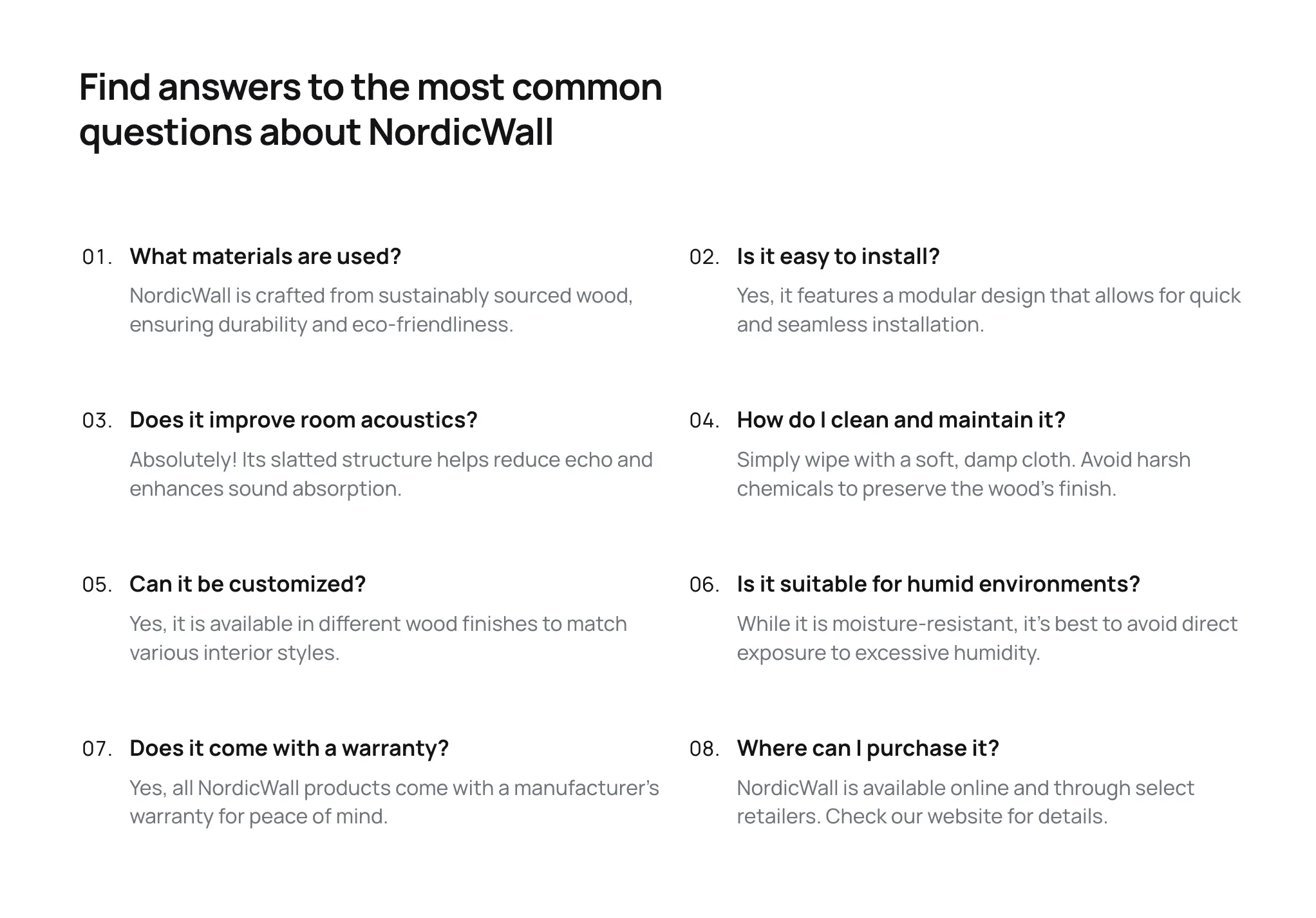
FAQ section: answer your visitors’ most important questions
The FAQ section is designed to help you build trust and reduce friction by providing clear answers to common questions. It starts with a section heading, followed by a list of question and answer pairs – ideal for addressing product details, service policies, or user guidance.
You can choose from a 1- or 2-column layout depending on the amount and complexity of your content. Each item includes a question and a detailed answer, displayed in a clean and readable format that works well across all screen sizes.
Managing content is simple thanks to the visual editor – just type in your questions and answers, and reorder or update them anytime. Whether you’re addressing pre-sale concerns or offering product guidance, the FAQ section helps remove barriers and improve user confidence.
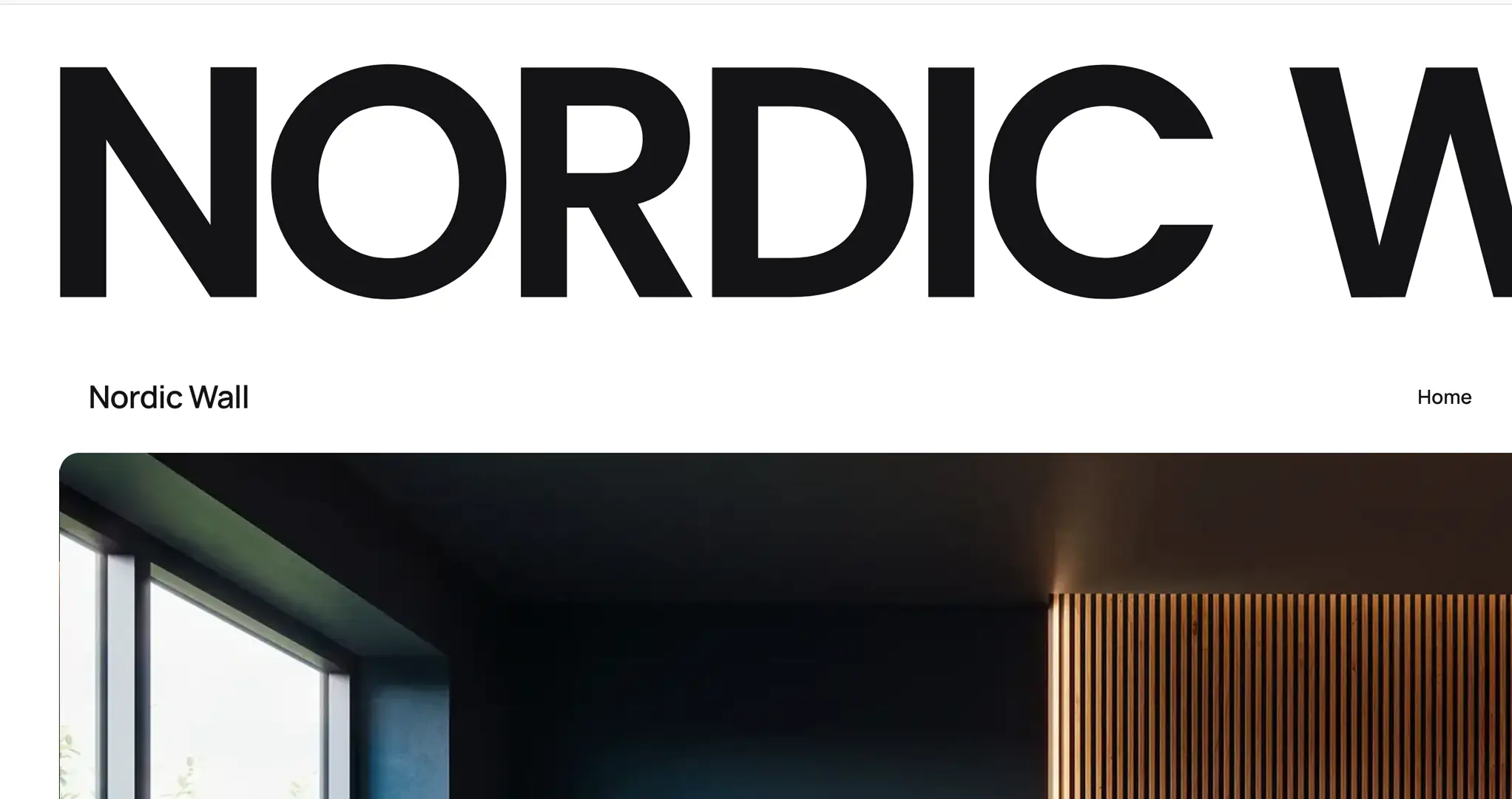
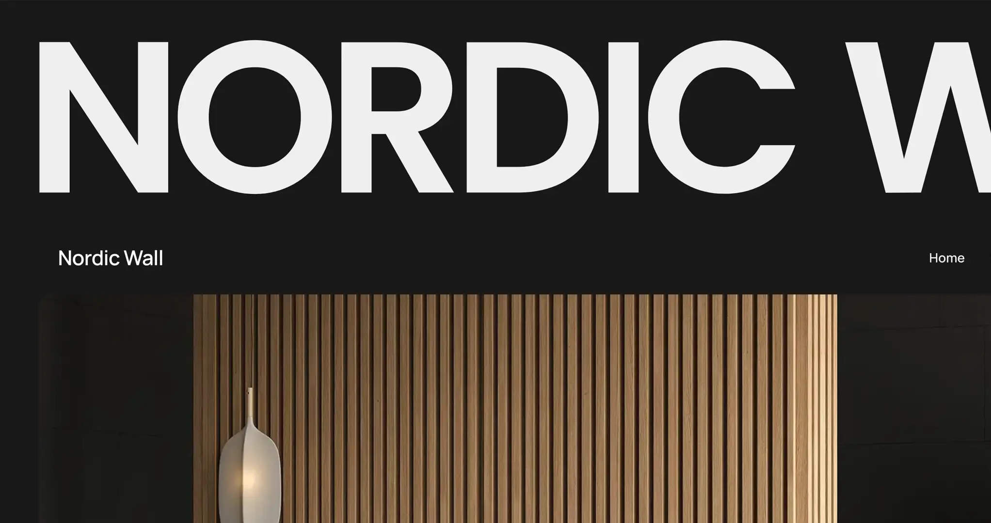
Light and dark mode: a seamless experience across all environments
Nordic Wall offers full support for both light and dark color modes, ensuring that your content looks great in any viewing context. You can select one of three display preferences: light mode only, dark mode only, or auto mode, which adapts to the system settings of each visitor’s device.
This flexibility allows you to maintain a consistent visual experience for your brand, while respecting the accessibility and comfort preferences of your audience. Whether viewed during the day or in low-light conditions, Nordic Wall automatically delivers the optimal look and feel.
Core design elements such as the primary color, text color, and link color can be easily customized using the theme’s visual interface. For advanced users, Nordic Wall also exposes a clean and well-structured set of CSS variables – giving you full control to override any style through the Custom CSS tool and tailor the theme to your brand’s exact visual language.
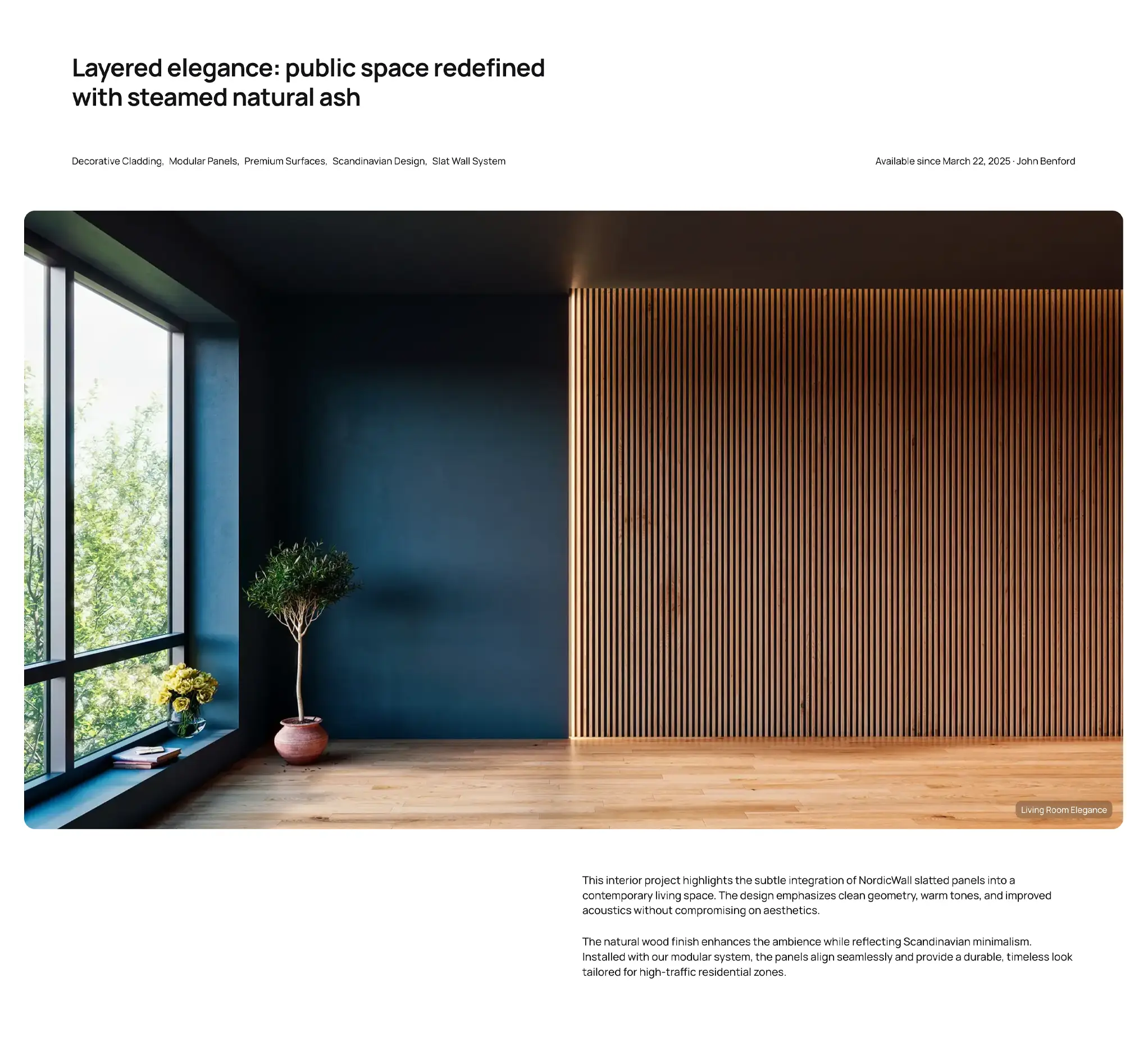
Post and page templates: flexible layouts for different content types
Nordic Wall includes four post/page templates to help you tailor the presentation of your content. The default template is optimized for blog posts – with a clean, readable layout that balances text flow with optional visuals.
In addition, the theme offers three specialized Project templates designed for showcasing visual work, case studies, or standalone projects. These layouts share a consistent structure but differ in how the main content is aligned: you can choose between left-aligned, centered, or right-aligned presentation, depending on your design goals and the type of content you’re publishing.
Switching between templates is simple – just open the right-hand sidebar in the editor and scroll to the Other options section – there, you can switch between available layouts with a single click.
Tag and author templates: two layouts for content discovery
The same flexibility applies to tag and author pages, which also offer two layout templates. The default layout displays a list of related posts aligned to the right, making it ideal for traditional blog navigation. Alternatively, you can choose the Project template to present curated content in a tile format – perfect for showcasing product collections or design case studies.
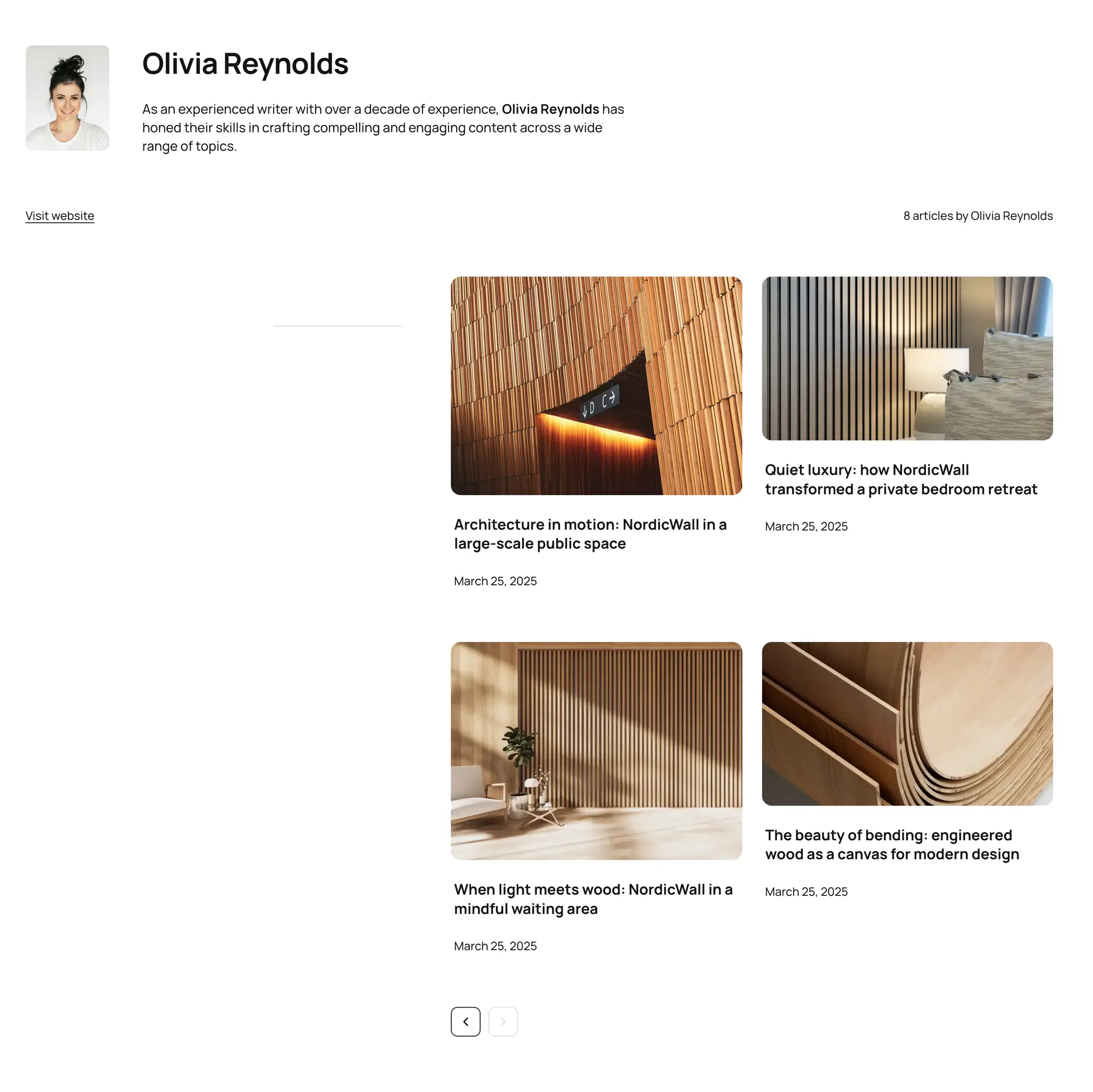
Tile and card layouts: two approaches to content presentation
Nordic Wall uses two distinct layout systems for displaying content: cards and tiles, each tailored to different use cases and visual priorities. Standard blog-related sections use a card layout – a compact format that includes the image, title, publication date, and optional excerpt. As described earlier, card behavior can be customized globally: you can adjust image ratios per device, change the fit mode, and toggle visibility of elements like titles, dates, and excerpts.
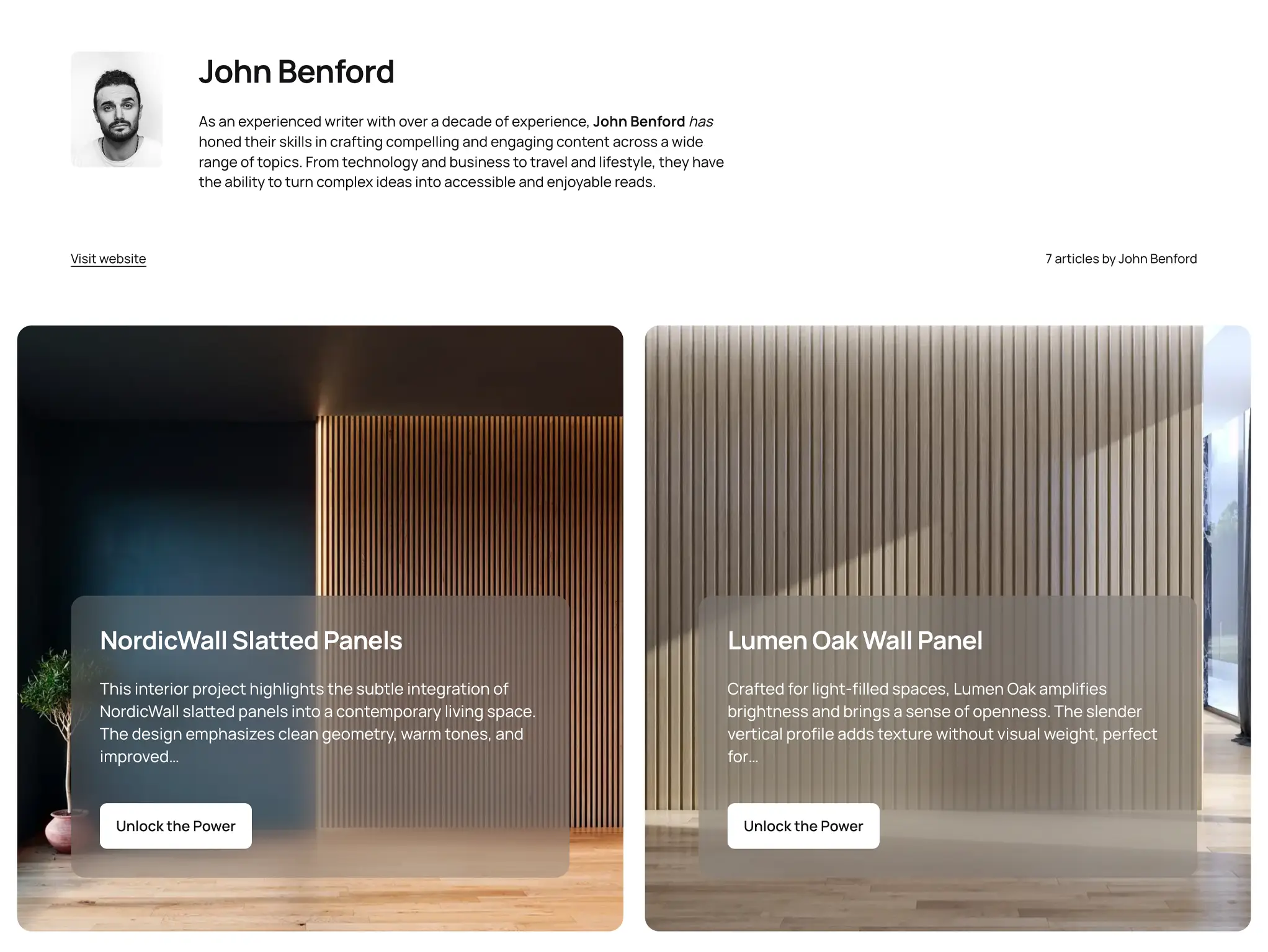
In contrast, the Features sections and Project templates for tag and author pages use a visually impactful tile layout. Each tile displays a full-width background image with overlaid text content, including a title, description, and optional button – ideal for highlighting projects or visual content.
Tiles come with their own set of advanced styling options. You can define different image aspect ratios for mobile, tablet, and desktop; set how the image fits inside its container; and customize the appearance of the text overlay using background colors, opacity levels, or backdrop-filter effects like blur and brightness. You can also control the text width inside the tile to ensure optimal legibility and alignment.
This dual layout system ensures your site can adapt seamlessly to both editorial and portfolio-style content – all while maintaining visual consistency and flexibility.
Subtle scroll animations for modern user experience
To enhance user engagement and visual depth, Nordic Wall integrates a set of refined scroll-triggered animations powered by Motion – a modern JavaScript animation library that leverages native browser performance and a declarative API.
All animations are carefully timed and subtle by design, ensuring that they complement the layout rather than distract from it. However, if needed, you can fully disable all scroll animations with a single switch in the theme settings.
* Plus VAT for EU customers
What's included
- Unlimited use - forever, on any number of domains
- 12 months of access to files and updates
- 3 months of premium support included
- 100% ready for personal and commercial use
- One-time payment - no automatic renewals, optional update access at 50% off
- Optimized for speed, SEO, and mobile experience
What's excluded
- Premium plugins are not included - available as a separate purchase
Details
- Author:
- Publii Team
- Version:
- Updated:
- Mar 03, 2026
Requirements and compatibility
- Browser:
- Edge, Firefox, Chrome, Safari, Opera
- Requirements:
- Publii 0.46.3 and up
Lightweight for a hyper-fast load time
Speed is of the essence when you're looking for answers, so our themes do not use jQuery libraries or CSS frameworks; just pure JavaScript and custom CSS for shorter load-times. For subtle scroll animations, we include the lightweight Motion library, which uses native browser APIs and adds no unnecessary overhead. You won't need to worry about FOUT or FOIT effects in your text either, as you can use system default fonts for instant, stable rendering.

Get 3 months of professional support
Getting started with a new theme on a new website can be a challenge, but our experts are here to help. Every purchase of the commercial theme includes three months of support through our dedicated ticket system, so you'll have efficient and effective assistance with any issues you run into.
Standard features *
Manage your page look and feel with extensive coloring, menu, social media sharing and layout options, or switch it up completely with one of our many unique themes.
* The available options may vary from theme to theme but they are mostly standardized.